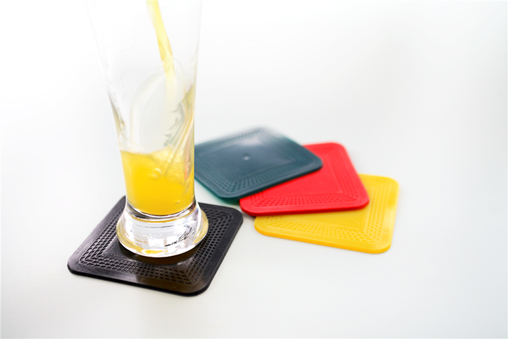
We caught up with Occupational Therapist Jen to discuss the Dycem colour range and its importance to her clients.
Dycem’s range of non-slip products come in a wide range of colours. New colours are always being considered and developed. “If I had to choose one colour of Dycem for all my clients I would find it incredibly difficult” says Jen. We agree that our silver Dycem mats are perfect for clients who want to be discreet, particularly if they are in a public area.
Some of Jen’s clients use their mats as a visual cue and therefore need to it to contrast with the surface it is placed on. For example, a yellow mat can be placed on a black counter – or a blue mat can be placed on a white table cloth.
Jen describes how colours are said to affect our physiology and mental state – “The colour red apparently stimulates appetite. What would happen if we used red Dycem mats or reel material in clinical situations where we are trying to encourage our clients to eat? Would hospital patients be more tempted by the food if they had a red plate and place mat?
On the other hand, blue and black are said to reduce the appeal of food. These colours are associated with rotten food and apparently make eating less appealing. I’m not quite sure where blueberries fit into this theory!
They say that yellow helps with focus and concentration. Perhaps then we should prescribe yellow Dycem products in schools and workplaces?” We loved the great uses Jen came up with.
Certain colours can work better in different situations, which is why Dycem has a variety of colour to choose from.
Let us know your favourite Dycem colour by voting in our poll!
[polldaddy poll=6695640]
Are there any Dycem colours you would like to see in the future? Let us know!
Useful information on colour contrast can be found on the Lighthouse International website.
Related articles
- At Home with Jen (dycemnonslip.wordpress.com)
